I was at once intrigued. I have a very loose knowledge of the Feng Shui principles, having applied certain bits to my own home. Even if you do not specifically subscribe to the belief that our homes have energy passing through them, and we can funnel that energy in ways that are beneficial to us, I think that anyone who is consciously working to create harmony and order in their home to better their life is probably applying this same effort in other areas of their life, and this will likely bring them some great results. There are also some facets of Feng Shui that simply reflect good design principles, such as incorporating mirrors to bounce light (or energy :) around, eliminating clutter and restricting your colour palette. There is also the familiarity factor: it may bring a certain sense of peace to a person knowing that specific areas of your home are always going to contain certain colours, for example.
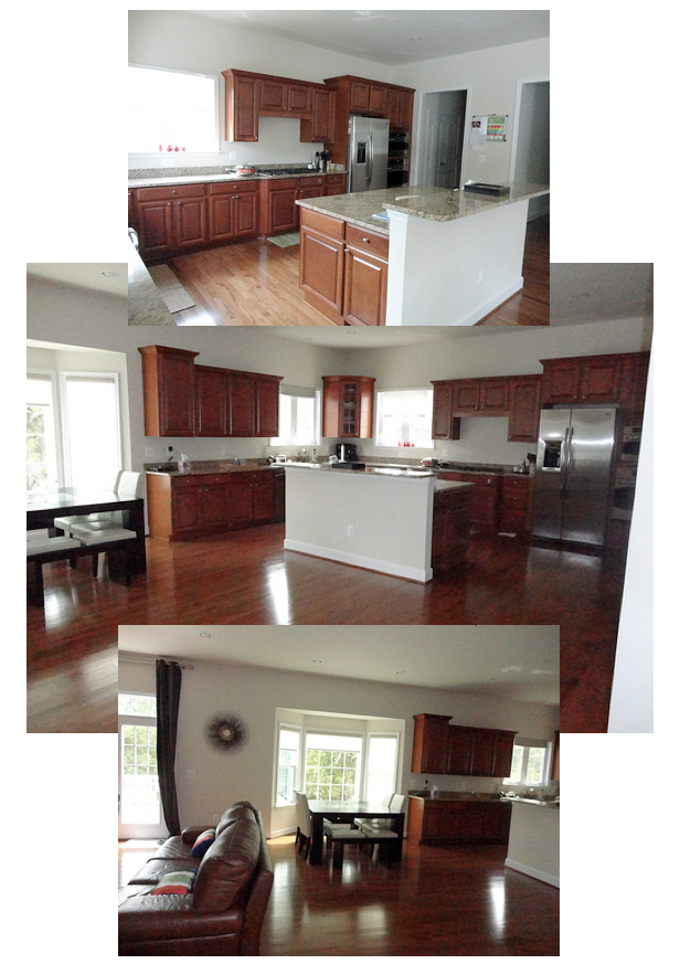
The first room K wanted to work on was her family room. A traditional modern family two-story, the family room is open to the kitchen/eating area.
Here are some of the before shots:
Beautiful wood floors that complement the cabinetry tones, a lovely fireplace with built-ins, a breakfast nook and plenty of natural light and space - this home has great bones to work with!
K wanted to work with blues or greys, to bring the best fang shui for the particular positioning and placement in the home found here. I agreed that cool-toned walls would work, as her space receives warm southern light and has all that lovely warm wood for balance. Blue pairs effortlessly with orange-toned woods because they are complements on the colour wheel, and blue brings out the richness of the wood. K has bold colours present throughout her home, and wanted this space to have some character.
After working out that K quite liked modern furnishings, we needed to find a way to mesh those styles with her home, which is much more traditional. She had already ordered a white leather sofa. The first thing to work on was the floor plan. By placing the sofa against the wall we opened up the room, creating a better flow (for Feng Shui and design purposes!) I suggested K purchase two chairs to face the sofa, thereby adding comfortable seating without blocking the doorway off. A low bench positioned where the sofa had previously sat provides additional seating for larger gatherings but still allows the two areas to be connected.
Since we are planning to move onto the living and dining areas next, I suggested adding a warm orange in small accents to give us another colour to pull out in the adjoining rooms. The wall colour you see here is Benjamin Moore 1626, Gentle Gray.
DESIGN TIP: When working with pale blues, you really want a grey with a blue undertone, rather than a true pale blue, or your room will look like a baby boys nursery :)
Chunky chairs in the same espresso finish as K's table and chairs help the two spaces to relate to one another, and of course we need a round coffee table - this is a major Feng shui principle - avoid corners whenever possible, they are thought to create disruptive energy within your home. a selection of carpets allows K to choose exactly how energetic she would like this space to feel, and of corse, the art references the Feng Shui water element we are channeling here.
K responded that she wanted to replace her dining set with something lighter and more modern, and that she was wary of making such large commitment to blue with the leather chairs. She sent a link to the dining set she was considering, and asked me to create a board incorporating that and the large floral carpet. These chairs work with the wood tones present, and the modern abstract back picks up on the legs of her new dining chairs. Having just the seat upholstered blue allows for that hit of colour without the commitment - it would be easy to swap out this fabric down the road.
After receiving that board, K mentioned wanting a more neutral option to show here husband, who wasn't sure about the blue. She had used Benjamin Moore OC-52 Gray Owl in another room in her home which faced north, and had thought it was a bit too cold for the family room. I assured her that in the warm southern light at the back of her home Gray Owl would appear more neutral, and suggested she try a swatch out.
I sent her another board illustrating this neutral palette option. I'm in love with that carpet. LOVE.
At this point we were nearing the beginning of holiday season. K wrote that she loved both options, but that she was leaning toward the more neutral version. After New Year's I got an email that made me smile :) K and her husband tried the Grey Owl on the wall, and found it did nothing for them, but the bluer option, Gentle Gray, looked wonderful! They decided to go ahead with the second blue design option, and were very happy with the progress so far. I'm hoping for some pics of the finished space to share with you...
and that, darlings, was my first official Feng Shui Design Consultation! Something of an adventure, and I learned a lot along the way... as side note, I may try to tackle how to bring some basic Feng Shui principles into your home in some future posts - would you ladies like to explore with me? I'm thinking a little cleaning a re-organizing can't hurt anyone.... my house could definitely use some love! x


No comments:
Post a Comment