Showing posts with label design. Show all posts

Sunday, 1 December 2013

La Cuisine Parfait


Every so often I come across something that literally takes my breath away.

That thing I have been searching for, yearning for, without being able to define it exactly.
And then I lapse into french, because it's so perfect.

Donc tres, très, parfaite.

This is one of those rare beauties.


I love a white kitchen, but they are tout simplement le bon, non?


I crave a new look, one completely original.
Classic lines mixed with some vintage chic, of course a little colour.


This space has that certain je ne sais quoi - 
it is perfectly comfortable in its own skin. 
Materials are used in ways that they are highlighted,
there is no need to shout their beauty - it simply shines.


Genius.


I am smitten. Et tu?

x am


Tuesday, 22 January 2013

Feng Shui in a Family Room

So this fall a really interesting client emailed requesting an online consult. K and her family have just recently moved into a new house, and are working toward creating a harmonious home incorporating Feng Shui.

I was at once intrigued. I have a very loose knowledge of the Feng Shui principles, having applied certain bits to my own home. Even if you do not specifically subscribe to the belief that our homes have energy passing through them, and we can funnel that energy in ways that are beneficial to us, I think that anyone who is consciously working to create harmony and order in their home to better their life is probably applying this same effort in other areas of their life, and this will likely bring them some great results. There are also some facets of Feng Shui that simply reflect good design principles, such as incorporating mirrors to bounce light (or energy :) around, eliminating clutter and restricting your colour palette. There is also the familiarity factor: it may bring a certain sense of peace to a person knowing that specific areas of your home are always going to contain certain colours, for example.

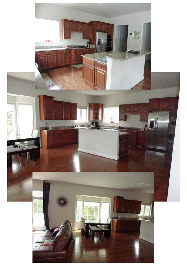
The first room K wanted to work on was her family room. A traditional modern family two-story, the family room is open to the kitchen/eating area.

Here are some of the before shots:


Beautiful wood floors that complement the cabinetry tones, a lovely fireplace with built-ins, a breakfast nook and plenty of natural light and space - this home has great bones to work with!


K wanted to work with blues or greys, to bring the best fang shui for the particular positioning and placement in the home found here. I agreed that cool-toned walls would work, as her space receives warm southern light and has all that lovely warm wood for balance. Blue pairs effortlessly with orange-toned woods because they are complements on the colour wheel, and blue brings out the richness of the wood. K has bold colours present throughout her home, and wanted this space to have some character.

After working out that K quite liked modern furnishings, we needed to find a way to mesh those styles with her home, which is much more traditional. She had already ordered a white leather sofa. The first thing to work on was the floor plan. By placing the sofa against the wall we opened up the room, creating a better flow (for Feng Shui and design purposes!) I suggested K purchase two chairs to face the sofa, thereby adding comfortable seating without blocking the doorway off. A low bench positioned where the sofa had previously sat provides additional seating for larger gatherings but still allows the two areas to be connected.


Since we are planning to move onto the living and dining areas next, I suggested adding a warm orange in small accents to give us another colour to pull out in the adjoining rooms. The wall colour you see here is Benjamin Moore 1626, Gentle Gray.

DESIGN TIP: When working with pale blues, you really want a grey with a blue undertone, rather than a true pale blue, or your room will look like a baby boys nursery :)


Chunky chairs in the same espresso finish as K's table and chairs help the two spaces to relate to one another, and of course we need a round coffee table - this is a major Feng shui principle - avoid corners whenever possible, they are thought to create disruptive energy within your home. a selection of carpets allows K to choose exactly how energetic she would like this space to feel, and of corse, the art references the Feng Shui water element we are channeling here.


K responded that she wanted to replace her dining set with something lighter and more modern, and that she was wary of making such large commitment to blue with the leather chairs. She sent a link to the dining set she was considering, and asked me to create a board incorporating that and the large floral carpet. These chairs work with the wood tones present, and the modern abstract back picks up on the legs of her new dining chairs. Having just the seat upholstered blue allows for that hit of colour without the commitment - it would be easy to swap out this fabric down the road.


After receiving that board, K mentioned wanting a more neutral option to show here husband, who wasn't sure about the blue. She had used Benjamin Moore OC-52 Gray Owl in another room in her home which faced north, and had thought it was a bit too cold for the family room. I assured her that in the warm southern light at the back of her home Gray Owl would appear more neutral, and suggested she try a swatch out. 


I sent her another board illustrating this neutral palette option. I'm in love with that carpet. LOVE.


At this point we were nearing the beginning of holiday season. K wrote that she loved both options, but that she was leaning toward the more neutral version. After New Year's I got an email that made me smile :) K and her husband tried the Grey Owl on the wall, and found it did nothing for them, but the bluer option, Gentle Gray, looked wonderful! They decided to go ahead with the second blue design option, and were very happy with the progress so far. I'm hoping for some pics of the finished space to share with you...

and that, darlings, was my first official Feng Shui Design Consultation! Something of an adventure, and I learned a lot along the way... as side note, I may try to tackle how to bring some basic Feng Shui principles into your home in some future posts - would you ladies like to explore with me? I'm thinking a little cleaning a re-organizing can't hurt anyone.... my house could definitely use some love! x


Thursday, 1 November 2012

Design Boards: Elegant Club House

It's been quite a busy fall, my online client list has almost surpassed my local client list! Thank you so much to all of you ladies who have entrusted me with the design direction for your homes - it's been a wonderfully creative couple of months around here, and it shows no signs of stopping...

I thought perhaps some of you would like to see some examples of the design boards I have been doing up. Colour consultations have been few and far between, with more and more clients requesting design consultations. This is exciting because I get to put the whole look together, rather than just a part of the puzzle.  Many of my clients this fall have had dramatically different taste, and that is what keeps me challenged and loving this job!

Let's begin with the Elegant Club House Client. This client's home backs onto a golf course, and she would like to combine her love of the outdoors and neutrals to create a country club feel within her great room and kitchen. This home was built in the seventies, and has great soaring ceilings and a large brick fireplace  which need to be left as is. The walls, kitchen cabinetry and built-in's will be painted, and the countertops, furniture and lighting replaced. The ECH Client requested a space that was up-to-date but had a timeless appeal, with a soothing atmosphere. She liked the idea of grey, and had just purchased a white and black ottoman that she loved.


Many rooms like this were considered...


These were on the right track, now the space must be fully considered before deciding on a personalized colour and design plan...

The pale grey-white brick of the fireplace meant grey was already part of our scheme, which works against the warmth of the hardwood floors and the sun from south-facing windows.

So we had it:

Steel grey upholstery balanced by warm grey paint on the walls and cabinetry, warm wood floors and furnishings. Black accents add some crucial contrast.


A television will be placed opposite the window of the great room, and so placement of the sofa under the window works well. A matching armchairs provides a cosy corner by the fire for relaxing and conversation, while two smaller armchairs provide additional seating and define the living area without blocking off the view to the fireplace.

The dining table is placed across the room, so that the dining views are the fireplace and into the kitchen beyond. Four chairs will serve for everyday meals, and two additional chairs for guests are tucked in alongside a small cabinet. This sideboard provides a place for display or to set up a bar/buffet for larger parties. It also grounds the dining table, making it part of a distinct area rather than just a table floating in the room.

In all pieces, clean lines are tempered by graceful curves and pattern is used sparingly to keep a restful atmosphere. The board below does not show many accessories, but the china that will be displayed inside my clients built-in's will offer plenty of eye candy on our focal wall.


The ECH fireplace is a bit of a conundrum (don't you just love that word?!)
It's asymmetrical placement in the fireplace facade had my Client baffled by how to decorate this area.
Once the built-in's a painted out in the pale grey we've chosen, this will be even more obvious. 
The client is considering adding a mantle, which isn't really necessary, and may even take away from the simplicity that makes this fireplace wall work.

I suggested two solutions:

One, place a pair of baskets like these beside the opening, stacked with logs, for balance,
 and centre some art above.
Adding art above a fireplace where it may be subject to heat requires some care - 
metal sculture is ideal here, and the organic forms of these pieces work well in this space.


The second option is simpler, and my favourite. Gather some tall branches into a glass vessel like the one shown below, and place them beside the hearth. This look doesn't require any additional accessories. I think this is a softer approach, and looks less "decorated". My client has decided to try this out before making any other decisions.


For the walls we've chosen Classic Gray, Benjamin Moore 1548, in the Ulti-Matte finish, which will minimize the textured walls.  Nimbus, Benjamin Moore 1465,  will be GORGEOUS on the cabinetry in the kitchen and built-ins. Happy to say the client has tried these out and loves them :) In the kitchen , I've suggested a dark countertop, perhaps soapstone or honed marble, to draw the eye around the room and create the illusion of space. My client has said this may be a challenge for her - she usually goes for "safe" neutrals, but likes the idea more each day.

And that, dear lovelies, is the Elegant Club House I've been working on in a nutshell.

Would you like to hear about the Rock & Roll Baroque Home? How about a working to create Feng Shui Harmony in a builder home?

I'll post about those soon, promise - 'til then - a big MWAH, miss you all - x

Wednesday, 9 May 2012

how the colour of your sofa can enlarge your room


Space is the ultimate luxury. I forget where I read that, but it's true. It doesn't matter how large your home is, it seems most of us are trying to create the feel of spaciousness within them. So today I'm going to show you how the colour of your sofa can make you room feel larger.

Lets' just consider the sofa for a moment - averaging 8 feet long, 40 inches deep, and 36" high, this space hog takes up over a hundred square feet in your room.  Crazy right? For that reason the sofa usually becomes the focal point of the room. But what if you would like something else to be the focal point - say, the fireplace?

How do you make the largest piece of furniture in the space unobtrusive?
Colour. Here's the top-secret trick - are you ready?!!!

 If there is a strong contrast between your sofa colour and your walls, the size of the sofa will be emphasized, and the space will seem smaller - BUT, if your sofa should blend into your walls or your floor it will visually disappear.

That doesn't mean they have to be the same colour, but similar VALUE (value = the darkness or lightness of a colour, a post on that is in the works :)

For example, here are two sides of the same room - the orange upholstery provides a huge contrast, while the leaf green blends in seamlessly to the peacock walls.


Let's look at a few high contrast spaces first so you can see how the sofa dominates the room.


In a few other spaces the floor grounds the sofa, and it becomes part of a larger whole....


Some examples of the sofa/wall colour combination.....isn't it amazing to see a red sofa settle so comfortably into a room?


Layering the walls, floor AND large pieces in the same tones creates a positively enormous room!


Especially when they are all done in white :)


There you go - one of my best tricks for creating a spacious living room, lovelies!
Would you try this in your own space? x am


photo links: 1  2  3   4   5   6   7   8   9  10  11   12   12   13   14 

Friday, 27 April 2012

exotic tribal + the amazing home of Diane von Furstenberg


The last post was about tribal elements and tribal inspired pieces primarily form Native Americans and the southwest, but today I am sharing a more exotic type of tribal influence. One the brings to mind images of far-off vistas and once-in-a-lifetime-dream-destinations like Africa....


I think the only mistake you can make with these is to try an "theme" your space - we aren't trying to reimagine a safari, just bringing in a few select pieces and accessories that make your heart skip a beat. I'm doing this in my own home - I just ordered this vintage mud cloth from an ebay seller.


Can't wait to see this beauty up close!! It will be mounted to a wooden frame and hung over my family room fireplace - there are eighteen foot ceilings in this room, and after debating a gallery wall I decided to go with one large scale piece. I'll happily take pics to share in the next weeks as this room is finally coming together :)


Here are some bits and pieces I think we will be seeing pop up more and more in the coming months...


luscious walls, and ideas for even more luscious walls :)


 art, with a super easy DIY idea for block printing with string and paint -- this would work with fabric paint for pillows, etc, as well, yes?


the horn - thinking this could be the next antler...


and I really couldn't do this post without including the AH-MAZING apt of DVF - have you seen this?!!

My absolute favourite right now. I love it all. Exactly the right mix of clean lines, pattern, glam and authenticity.


Ready to move in? Me too. Hope you have a lovely weekend planned, we are having round two of the family celebrations for Miss N's birthday. I am officially Mum to a teen. Scary :) x am


photo links: breastplate shorts woman woman 2 Tiébélé dwellings bag walls 1 wallpaper horn 3 horns batik pillows Wllpaper carpet kuma pillow console+horn Anne-Marie Ezeard / Pinterest( elephant blanket (yarn block print Tribal inspired print DVF apartment