Showing posts with label color. Show all posts

Thursday, 7 November 2013

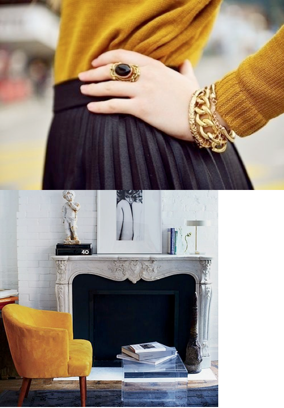
saffron, mustard, gold: feeling warm yellows


It's fall, and every fall the cravings for warm hues comes rushing back. They bring a glow to our homes, and welcome us in the most cordial of ways.

Several years back, the lemon yellows took over as the sunshine hue of choice: they were intense, powerful, and offered a freshness that had been lacking, especially when paired with high contrast black and white as they so often were (we used that palette is my eldest daughters room back when). Cool, saturated yellows are difficult to embrace for a long time, however -  high maintenance, shouting out for attention. So yellow faded from popularity, and has taken a back seat to pinks, oranges and corals the past few years.

Well, darlings, I think it's about time for a revival! I know emerald green has tickled your fancy, and all the taste makers are heralding the return of jewel-toned blues.. but I think that warm, blackened yellows are due for some love, and we will be seeing more and more of these luscious, radiant tones turning up....


What do you think? Want to bask in this glow?

Perhaps a more subtle bit of sunshine, in the form of November's birthstone, Citrine.
It's said to bring success and personal vitality.....


                                                                              1 2 3 4


xo am


Thursday, 1 November 2012

Design Boards: Elegant Club House

It's been quite a busy fall, my online client list has almost surpassed my local client list! Thank you so much to all of you ladies who have entrusted me with the design direction for your homes - it's been a wonderfully creative couple of months around here, and it shows no signs of stopping...

I thought perhaps some of you would like to see some examples of the design boards I have been doing up. Colour consultations have been few and far between, with more and more clients requesting design consultations. This is exciting because I get to put the whole look together, rather than just a part of the puzzle.  Many of my clients this fall have had dramatically different taste, and that is what keeps me challenged and loving this job!

Let's begin with the Elegant Club House Client. This client's home backs onto a golf course, and she would like to combine her love of the outdoors and neutrals to create a country club feel within her great room and kitchen. This home was built in the seventies, and has great soaring ceilings and a large brick fireplace  which need to be left as is. The walls, kitchen cabinetry and built-in's will be painted, and the countertops, furniture and lighting replaced. The ECH Client requested a space that was up-to-date but had a timeless appeal, with a soothing atmosphere. She liked the idea of grey, and had just purchased a white and black ottoman that she loved.


Many rooms like this were considered...


These were on the right track, now the space must be fully considered before deciding on a personalized colour and design plan...

The pale grey-white brick of the fireplace meant grey was already part of our scheme, which works against the warmth of the hardwood floors and the sun from south-facing windows.

So we had it:

Steel grey upholstery balanced by warm grey paint on the walls and cabinetry, warm wood floors and furnishings. Black accents add some crucial contrast.


A television will be placed opposite the window of the great room, and so placement of the sofa under the window works well. A matching armchairs provides a cosy corner by the fire for relaxing and conversation, while two smaller armchairs provide additional seating and define the living area without blocking off the view to the fireplace.

The dining table is placed across the room, so that the dining views are the fireplace and into the kitchen beyond. Four chairs will serve for everyday meals, and two additional chairs for guests are tucked in alongside a small cabinet. This sideboard provides a place for display or to set up a bar/buffet for larger parties. It also grounds the dining table, making it part of a distinct area rather than just a table floating in the room.

In all pieces, clean lines are tempered by graceful curves and pattern is used sparingly to keep a restful atmosphere. The board below does not show many accessories, but the china that will be displayed inside my clients built-in's will offer plenty of eye candy on our focal wall.


The ECH fireplace is a bit of a conundrum (don't you just love that word?!)
It's asymmetrical placement in the fireplace facade had my Client baffled by how to decorate this area.
Once the built-in's a painted out in the pale grey we've chosen, this will be even more obvious. 
The client is considering adding a mantle, which isn't really necessary, and may even take away from the simplicity that makes this fireplace wall work.

I suggested two solutions:

One, place a pair of baskets like these beside the opening, stacked with logs, for balance,
 and centre some art above.
Adding art above a fireplace where it may be subject to heat requires some care - 
metal sculture is ideal here, and the organic forms of these pieces work well in this space.


The second option is simpler, and my favourite. Gather some tall branches into a glass vessel like the one shown below, and place them beside the hearth. This look doesn't require any additional accessories. I think this is a softer approach, and looks less "decorated". My client has decided to try this out before making any other decisions.


For the walls we've chosen Classic Gray, Benjamin Moore 1548, in the Ulti-Matte finish, which will minimize the textured walls.  Nimbus, Benjamin Moore 1465,  will be GORGEOUS on the cabinetry in the kitchen and built-ins. Happy to say the client has tried these out and loves them :) In the kitchen , I've suggested a dark countertop, perhaps soapstone or honed marble, to draw the eye around the room and create the illusion of space. My client has said this may be a challenge for her - she usually goes for "safe" neutrals, but likes the idea more each day.

And that, dear lovelies, is the Elegant Club House I've been working on in a nutshell.

Would you like to hear about the Rock & Roll Baroque Home? How about a working to create Feng Shui Harmony in a builder home?

I'll post about those soon, promise - 'til then - a big MWAH, miss you all - x

Wednesday, 9 May 2012

how the colour of your sofa can enlarge your room


Space is the ultimate luxury. I forget where I read that, but it's true. It doesn't matter how large your home is, it seems most of us are trying to create the feel of spaciousness within them. So today I'm going to show you how the colour of your sofa can make you room feel larger.

Lets' just consider the sofa for a moment - averaging 8 feet long, 40 inches deep, and 36" high, this space hog takes up over a hundred square feet in your room.  Crazy right? For that reason the sofa usually becomes the focal point of the room. But what if you would like something else to be the focal point - say, the fireplace?

How do you make the largest piece of furniture in the space unobtrusive?
Colour. Here's the top-secret trick - are you ready?!!!

 If there is a strong contrast between your sofa colour and your walls, the size of the sofa will be emphasized, and the space will seem smaller - BUT, if your sofa should blend into your walls or your floor it will visually disappear.

That doesn't mean they have to be the same colour, but similar VALUE (value = the darkness or lightness of a colour, a post on that is in the works :)

For example, here are two sides of the same room - the orange upholstery provides a huge contrast, while the leaf green blends in seamlessly to the peacock walls.


Let's look at a few high contrast spaces first so you can see how the sofa dominates the room.


In a few other spaces the floor grounds the sofa, and it becomes part of a larger whole....


Some examples of the sofa/wall colour combination.....isn't it amazing to see a red sofa settle so comfortably into a room?


Layering the walls, floor AND large pieces in the same tones creates a positively enormous room!


Especially when they are all done in white :)


There you go - one of my best tricks for creating a spacious living room, lovelies!
Would you try this in your own space? x am


photo links: 1  2  3   4   5   6   7   8   9  10  11   12   12   13   14 

Tuesday, 21 February 2012

yea or nay: the orange movement


Orange. No other colour does happy so well. Yellow likes shout and be the centre of attention, and pink always want to bring love into it, but only orange is happy for the sake of being happy.


For many years, orange was my favourite hue. I once had a bedroom with walls the colour of tang :)  It was the most wonderful room to wake up in. In our last home, every room had at least a splash of it - even my kitchen chairs were orange!

Pantone has chosen Tangerine Tango as their colour of the year, and while I don't agree with people using a colour just for the sake of being trendy (covered that in last years post about the colour of the year) , this warm orange is quite fitting for the times.


Tangerine Tango skews toward red, and all that warmth is as enveloping as red, but without any aggression. While people around the globe are trying to put their lives back together after a tumultuous few years, we could all use a little extra warmth and happiness, right?


 I have always liked orange best when it was clean, perhaps containing a bit more white, or flirting with yellow, rather than red...


but right now, the softer side of orange is on my radar.... (that's thursdays post :)


What do you think? Is there a place in your home for these exuberant orange hues?


pots   dress   mirrors  sofagreywalls   kitchen   boholiving   outdoor dining   sofa&drapes   espresso kitchen   stools&lights kitchen   cabinet   wall

Friday, 13 January 2012

the difference between gray, grey, warm grey, beige, greige, and taupe


Yesterday, I was speaking to a client about the difference between grey, greige, beige and taupe.

It's a conversation I have A LOT!

 I thought perhaps a post about how I explain it to my clients
would be helpful to sort through these terms more easily,
and so here we are :)


First off, for our purposes,
gray (American spelling) and grey (Canada, the UK and Australia) are the same thing.
Just like color (American) and colour (Canada, UK and Australia).
In some technical circles, gray would describe only the grays from the grayscale,
but we're not all that fancy here at 10 Rooms, are we?!
I'm trying to make this simpler, not more difficult...


Let's just start off by saying true grey is any mixture of black and white.
That means that black, white and grey are the only true neutrals.


That said, when we are discussing colour, 
we generally include more than just those colours.

Once pigment is added to a mixture of black and white (grey),
it actually becomes a colour,
although the undertone may be almost imperceptible to the eye.


Therefore, grey, as we know it, can actually have any undertone,
but only purple, green or blue can be added in larger quantities 
for the colour to retain it's title as grey, because these will all produce cool tones.

Are you asleep yet?!!

Lets' define grey as 
black + white = grey
or
black + white + green/blue/purple = grey.


Sound good?


Now let's head into the beige territory.

Beige basically describes the umpteen versions of light brown.
To make brown you add complements from the colour wheel.


When you add complements,
what you are actually adding are all the primaries together in varying amounts.

Blue + orange
is actually
blue + yellow & red.

Yellow + purple
is actually 
yellow + blue & red.

Red + green
is actually
red + yellow & blue.


That is why adding complements always makes a brown,
and why adding different complements creates different browns, 
usually ones that are predominantly yellow, red, or occasionally orange.


So, we know beige contains some red and some yellow, and some blue,
but what else is in it?

White.
White lightens up your brown to beige.

So lets define beige as

white + red & or yellow + a little blue = beige.


So where does greige fit in?

To grey down beige, you simply add black, because the white is already present.

Let's define greige as 

white + black + red & or yellow + perhaps a little blue = greige


Yes, that would be the entire colour wheel!

That's quite a colour-techy way to look at things, 
but I think it's helpful to understand the way colours interact,
and then it all makes sense, doesn't it?


SO -


 when you're looking at a colour, and trying to determine what it actually is,
you need to look at the subtle undertones.

If it's cool, with a blue, purple, or green tint, it's a grey.
(I wrote a post about choosing the right grey, here)


If it's warm, with a red, orange or yellow undertone visible, it's a beige.


And if it's warm, but contains black, it's a greige (or as so many people say, a warm grey)


source 1 2 3 4 5 6 7 8 10 11 12 13 14 15 16


Does that makes sense, lovelies?


If you have more questions, please leave them in the comments, and I will respond tout de suite - x

Happy friday... hope your weekend is filled with love and laughs...


oh - and taupe?
That's just a fancy way of describing a red-based beige,
with a little green thrown in,
so that what you end up with is a slight dirty pinky-beige.
It's not actually a group of colours, but different variations of the same mix.