Showing posts with label color post. Show all posts

Thursday, 7 November 2013

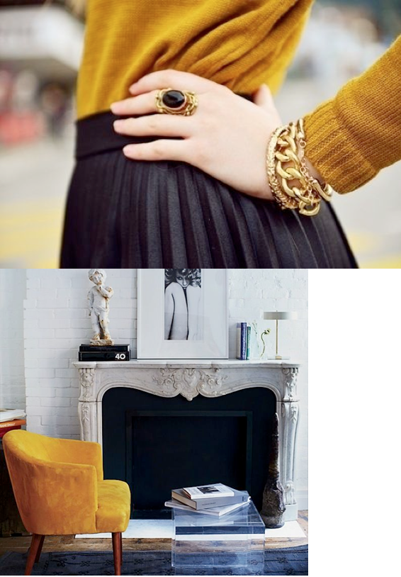
saffron, mustard, gold: feeling warm yellows


It's fall, and every fall the cravings for warm hues comes rushing back. They bring a glow to our homes, and welcome us in the most cordial of ways.

Several years back, the lemon yellows took over as the sunshine hue of choice: they were intense, powerful, and offered a freshness that had been lacking, especially when paired with high contrast black and white as they so often were (we used that palette is my eldest daughters room back when). Cool, saturated yellows are difficult to embrace for a long time, however -  high maintenance, shouting out for attention. So yellow faded from popularity, and has taken a back seat to pinks, oranges and corals the past few years.

Well, darlings, I think it's about time for a revival! I know emerald green has tickled your fancy, and all the taste makers are heralding the return of jewel-toned blues.. but I think that warm, blackened yellows are due for some love, and we will be seeing more and more of these luscious, radiant tones turning up....


What do you think? Want to bask in this glow?

Perhaps a more subtle bit of sunshine, in the form of November's birthstone, Citrine.
It's said to bring success and personal vitality.....


                                                                              1 2 3 4


xo am


Wednesday, 9 May 2012

how the colour of your sofa can enlarge your room


Space is the ultimate luxury. I forget where I read that, but it's true. It doesn't matter how large your home is, it seems most of us are trying to create the feel of spaciousness within them. So today I'm going to show you how the colour of your sofa can make you room feel larger.

Lets' just consider the sofa for a moment - averaging 8 feet long, 40 inches deep, and 36" high, this space hog takes up over a hundred square feet in your room.  Crazy right? For that reason the sofa usually becomes the focal point of the room. But what if you would like something else to be the focal point - say, the fireplace?

How do you make the largest piece of furniture in the space unobtrusive?
Colour. Here's the top-secret trick - are you ready?!!!

 If there is a strong contrast between your sofa colour and your walls, the size of the sofa will be emphasized, and the space will seem smaller - BUT, if your sofa should blend into your walls or your floor it will visually disappear.

That doesn't mean they have to be the same colour, but similar VALUE (value = the darkness or lightness of a colour, a post on that is in the works :)

For example, here are two sides of the same room - the orange upholstery provides a huge contrast, while the leaf green blends in seamlessly to the peacock walls.


Let's look at a few high contrast spaces first so you can see how the sofa dominates the room.


In a few other spaces the floor grounds the sofa, and it becomes part of a larger whole....


Some examples of the sofa/wall colour combination.....isn't it amazing to see a red sofa settle so comfortably into a room?


Layering the walls, floor AND large pieces in the same tones creates a positively enormous room!


Especially when they are all done in white :)


There you go - one of my best tricks for creating a spacious living room, lovelies!
Would you try this in your own space? x am


photo links: 1  2  3   4   5   6   7   8   9  10  11   12   12   13   14 

Friday, 13 January 2012

the difference between gray, grey, warm grey, beige, greige, and taupe


Yesterday, I was speaking to a client about the difference between grey, greige, beige and taupe.

It's a conversation I have A LOT!

 I thought perhaps a post about how I explain it to my clients
would be helpful to sort through these terms more easily,
and so here we are :)


First off, for our purposes,
gray (American spelling) and grey (Canada, the UK and Australia) are the same thing.
Just like color (American) and colour (Canada, UK and Australia).
In some technical circles, gray would describe only the grays from the grayscale,
but we're not all that fancy here at 10 Rooms, are we?!
I'm trying to make this simpler, not more difficult...


Let's just start off by saying true grey is any mixture of black and white.
That means that black, white and grey are the only true neutrals.


That said, when we are discussing colour, 
we generally include more than just those colours.

Once pigment is added to a mixture of black and white (grey),
it actually becomes a colour,
although the undertone may be almost imperceptible to the eye.


Therefore, grey, as we know it, can actually have any undertone,
but only purple, green or blue can be added in larger quantities 
for the colour to retain it's title as grey, because these will all produce cool tones.

Are you asleep yet?!!

Lets' define grey as 
black + white = grey
or
black + white + green/blue/purple = grey.


Sound good?


Now let's head into the beige territory.

Beige basically describes the umpteen versions of light brown.
To make brown you add complements from the colour wheel.


When you add complements,
what you are actually adding are all the primaries together in varying amounts.

Blue + orange
is actually
blue + yellow & red.

Yellow + purple
is actually 
yellow + blue & red.

Red + green
is actually
red + yellow & blue.


That is why adding complements always makes a brown,
and why adding different complements creates different browns, 
usually ones that are predominantly yellow, red, or occasionally orange.


So, we know beige contains some red and some yellow, and some blue,
but what else is in it?

White.
White lightens up your brown to beige.

So lets define beige as

white + red & or yellow + a little blue = beige.


So where does greige fit in?

To grey down beige, you simply add black, because the white is already present.

Let's define greige as 

white + black + red & or yellow + perhaps a little blue = greige


Yes, that would be the entire colour wheel!

That's quite a colour-techy way to look at things, 
but I think it's helpful to understand the way colours interact,
and then it all makes sense, doesn't it?


SO -


 when you're looking at a colour, and trying to determine what it actually is,
you need to look at the subtle undertones.

If it's cool, with a blue, purple, or green tint, it's a grey.
(I wrote a post about choosing the right grey, here)


If it's warm, with a red, orange or yellow undertone visible, it's a beige.


And if it's warm, but contains black, it's a greige (or as so many people say, a warm grey)


source 1 2 3 4 5 6 7 8 9 10 11 12 13 14 15 16


Does that makes sense, lovelies?


If you have more questions, please leave them in the comments, and I will respond tout de suite - x

Happy friday... hope your weekend is filled with love and laughs...


oh - and taupe?
That's just a fancy way of describing a red-based beige,
with a little green thrown in,
so that what you end up with is a slight dirty pinky-beige.
It's not actually a group of colours, but different variations of the same mix.




Friday, 12 August 2011

color post: green and grey


A while back I did a grey and pink post, 
and asked which other combos you'd like to see,
and the most common response was green and grey.


This surprised me a little,
as I've yet to have a client request this combination in their home.
That said, the rejuvenating effects of green work perfectly to counter the sometimes dulling effects of grey,
making this a fabulous combination to both relax you and uplift your spirits.

I think the saturation of the green is the key to getting this mix right.

Pale greens will be better enhanced by warm neutrals,
which flatter by intensifying green and making them appear fuller.
Cool greys require more vivid greens that have enough strength for a rich and balanced palette.


Grey - softened:
here, the warmth of greyed down woods bridge the gap between sisal floors and grey walls.
The emerald green accents add a punch to the otherwise neutral space.

This is my favourite look, where a bit of warmth keeps things from being chilly.
An incredibly liveable space, right?


High Drama:
the coolest grey on the walls is a good choice to complement the white and black in the space,
but I'm curious to see if you would find this palette welcoming.

I suspect this grey is almost solely comprised of black and white, with very, very little undertone.
If you removed the green curtains and chair,
 it would almost appear to be a black and white photo, wouldn't it?


Grey Love:
When you are ready to make a commitment to grey, but are trying on green.

The question is, how much green do you want?
Grey furnishings, white walls and green accents -
or grey furnishings, green walls and white accents?


A flexible look for the no-house-is-ever-truly-finished-decorator:
grey walls, white furniture, and green accents.

With grey as popular as it is, the walls will last you a few years of palette changes,
and the green accents are simple to change when you tire of them, say, next year :)


source 1 2 3 4 5 6 7 8 


Some of you asked if I could list grey paints for you to try,
and I was going to begin including my favourites in my posts,
but the truth is, the paints I like may not work for you.
It would be awful for you to paint your home a certain color because someone said how beautiful it was,
and then end up really unhappy with the finished results.
The light and existing finishes in your home, and your personal preferences,
mean that every home is unique, and every home should have it's own personalized color palette.

Colors that YOU love, not colors I love!
(you may not know it but I do on-line consults now, they've become quite popular,
and if you'd like a hand choosing paint for your home just drop me aline and we'll get started)

So, after all that :) ...


what do you think about green and grey together?
Is it a combination you would try out?


Wednesday, 20 July 2011

color post: which pinks love grey


For so many years beige, or some form of warm neutral,
was the go-to backdrop for every space.

Now, with grey at the forefront of design,
many of us are trying to make the switch from warm neutrals to cool ones...


Concerned about creating a space that feels "cold", 
my clients usually want to incorporate some colorful accents when using grey on the walls.

 A question I am constantly asked is what colors work with grey.

If you read my post on clean color,
you'll know that almost any hue works with grey, 
what's important is that it is a pure hue that has been mixed only with white, black, or grey.


but one of my favourite combinations is grey mixed up with pink and it's cohorts...


and when I saw this living room, I swooned, because the color mix is exactly right.

 grey wall and sofa + with fresh garden hues - how about that lush emerald?

(and note how the pillow on the right, sconce art and side table 
pick up the the warm tones found in the wood floor and allow for a harmonious mix.)


Black adds glam to the combo, 
and although I may have chosen a slightly cooler tone for the walls,
those chairs are showstoppers, aren't they?


Turquoise plays well with fuchsia against a serene dove grey backdrop, 
because they are equal in saturation.


Just as the palest of pinks pairs perfectly with the palest of greys to create this tranquil space.


The pink is fairly dominant in these living/dining rooms at first glance,
 but it's actually only the sofa and flowers that are pink.

So much impact from one piece of furniture!

Look how differently the paint and sofa color appear in the different photos.
This is why you should never choose a paint color based solely on a photo!!!
(hmm... I smell a future post :)


and some pretty bits of high contrast...
so want that painting, top left.


1 2 3 4 5 6 7 


What do you think?
Would you ever use this combination?

Since they are so popular right now,
I think I'll do a few posts exploring grey based color schemes...

any particular one you'd like to see explored next?