Thursday 31 March 2011

Move Over Turquoise, There's A New Girl In Town!


The eighties were a bad time, fashion wise :)
I know there's a wee bit of a revival going on,
but I've got to tell you, I was there, and it wasn't pretty!

In grade eight I wore candy floss pink and mint green almost exclusively.
It made getting ready in the morning simple,
but immersing yourself in a certain color so completely requires a long break later -
turquoise is headed in this direction for many.

After a prolonged absence from popularity,
mint green is looking fresh again.

It started with the iconic Domino book cover.
I almost used mint green in my own bedroom after being entranced
 by the spectacular Portobello chinoiserie by DeGournay
(I am re-thinking this... to be continued!)


Mint green started popping up on the fashion front...

the soft version


or the way I like it :)


1 2 3


People tend to think of pastels as girly,
and paired with white they definitely exude feminine charm...


1 2  3 4 


but grounded with blacks, dark greys or browns,
mint green is sophisticated, and slightly moody.


1 2 3 


Trendwise, as we move from bright color and glossy finishes toward more organic based palettes,
I think pastels will be creeping in more and more.

What do you think?
Are you ready to re-visit mint green?


1 2 3 4


Tuesday 29 March 2011

Need Art? Free Vintage Printable Site

Some days I get lost in the internet.

Simply checking email or creating a board for a client becomes
an all-out adventure...
merrily click-click-clicking away...
and then success - elation at finding little-known bits of talent and spectacular resources.

I'm not alone here, right?
Hope I'm not the only one spending entirely too much time "researching" :)

Anyhow, this one you will like.
I was looking through the vintage botanical charts available for a client
and found...

a blog titled Vintage Printable - sounds promising already, doesn't it?

There are heaps and heaps of art to be had here, lovelies.
Did I mention it was all free?

They also suggest using their images to create fabric on Spoonflower,
which had my head reeling with the possibilities!
(Spoonflower is a create-your-own-fabric site that I found through Christine
 and before you head over there just be warned it's highly addictive!!)

 The only downfall is how slowly the site loads (so much data)
but you can click here to peruse their finds through google images..

I am absolutely using these in a nursery at some point.


hello, games room...


I know hanging a grouping of empty frames was a trend a while back,
 but really,
 which one would you rather have?


even bulletin boards need some love :)


I am always telling clients that their accessories tell a story,
and they should be chosen with care.
Those layers you add to your home are the things that set your home apart from everyone else's.
Skip the mass produced art and
lets fill in the blanks with interest, shall we?

happy clicking!


Monday 28 March 2011

Home and Happy...

source


Has it only been two weeks?
It feels like so long since I've been posting.
A huge thanks to all the Crushing on Colors ladies
 for their wonderful posts that kept the blog hopping 
while I was soaking up some vitamin d.

Want to see what we were up to?

We travel to florida almost every spring, 
but don't always hit the parks.

This was a theme park year.

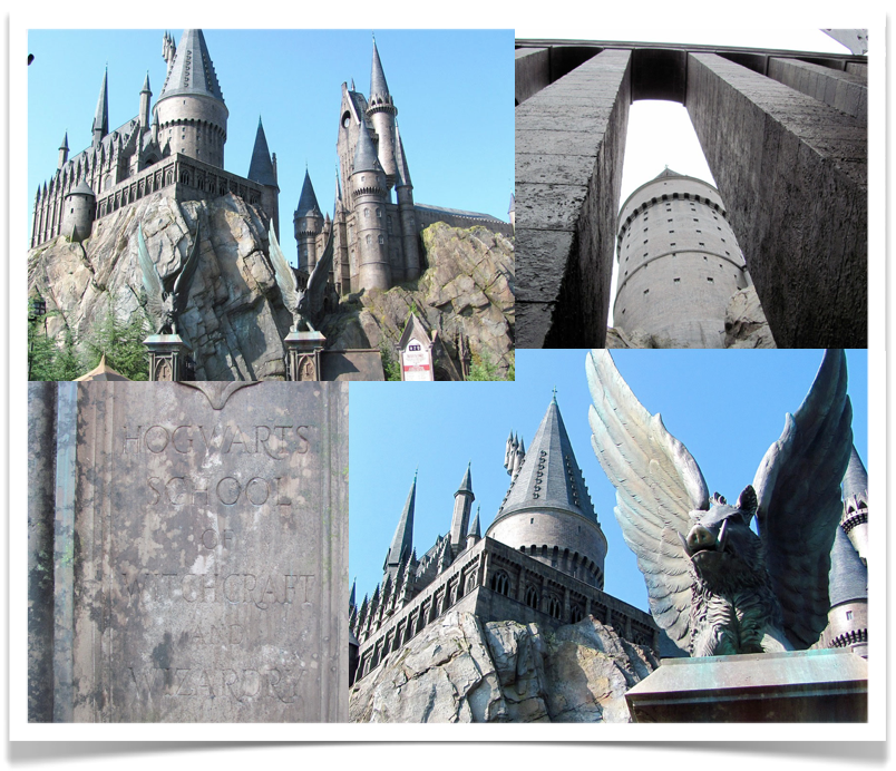
Day 1 and the kids were beelining for Harry Potter at Universal Studios!
Apparently several thousand other people were doing the same thing,
and it was a wee bit crowded :)


But we persisted and what an astonishing place.
If you have read the series 
(you must read them, the books are far richer than the movies)
you would have been amazed to see the main street of Hogsmeade brought to life, 
a scaled down Hogwarts towering off at the top of the cobblestone streets.


"Mum, another picture?!!"
They were so patient with me,
 taking pics and endlessly examining all the design elements they used in the castle :)


The Hogwarts tour is spectacular,
entering straight into Dumbledore's office 
(complete with a hologram of the headmaster himself),


then through the passageways, where paintings come to life,
ceilings glow, and stairs lead off into hidden passages..


A hologram Harry, Ron and Hermione visit you in potions class,
and then it's on to a hair-raising ride.


To celebrate, the darlings (and some friends) had butterbeer!


Then they watched Hogwarts and other students perform on the streets,


visited Ollivanders and chose wands,


had their fingers attacked by a caged Book of Monsters at Dirvish and Banges..


rested in the Owlry, dined in The Three Broomsticks...


checked out the pranks and toys at Zonkos...


 and brought home chocolate frogs and Bernie Bot's every flavoured beans from Honeydukes.


Crazy, no?!

Two days of that required some serious down time at the beach and pool
and then back to fun at Sea World..


and Aquatica, Sea World's water park -
 by far the best theme park I have been to!
So relaxing, two huge wave pools surrounding an enormous sandy "beach",
and heaps of exhilarating rides with no or very small lines.
The darlings have inherited D's and my love of speed :)


That face says it all, doesn't it?!!
Plenty of good food, time with friends, and shopping (!!) completed a wonderful trip.

I didn't take any color or design books, determined to have a break from"work".

By day six I had bought three design magazines and was
"popping in" to Z Gallerie and Ballard designs at  the mall :)

can't stay away!!!
And glad to be back!

I have found the coolest blog dedicated to provided free vintage images for general use.
There's some really gorgeous bits..
I will post all about it tomorrow - x


Saturday 26 March 2011

Crushing on Color: Poppy from Project Gadabout


Today's Crushing on Color post is brought to you by
the creative wonder,


The ceiling in my office is littered with lanterns.  
All different colors and sizes.  
It started off as a simple little collection and grew into something much bigger.  
What I love about the lanterns, is that when my day becomes to much, 
I take a moment, lay on the floor and drift away with my lanterns.
  
The best part is watching my cat Marmalade; 
somedays he is really determined to find a way to play with them.  
He has yet to succeed, but it’s fun watching him try. 
Plus my office is just a bottle of champagne and a 
few hors d'oeuvres away from being a cocktail party!


Organization is one of my hobbies (I know, it's a strange hobby).
 As a result, I take organization pretty seriously. 
So it's no surprise that most of my storage is colorful. 
It makes opening up my closet or glancing past my shelves
 a lot like stepping through a box of crayons. 
Oddly enough, it also helps me remember where I put things. 
Trust me, a color system is much more fun than numbers and boring labels.


It’s absolutely amazing how much fun a grocery list
 or to do list can be when you add a little color.  
I rarely use the typical; black, red or blue ink, 

I’m more of a Fandango Pink or Deep Sea Blue.  

I love taking notes or just doodling with a full array of colors at hand. 
As I’ve already mention before I love what bic is doing with the permanant marker.  
Copic is my personal favorite with their ability for great blending and shading.  


I’ve seen this tape used so many ways it’s impossible to not love it.  
From wrapping presents, a delightful border, 
or an amazing Art Installation, like the one found in the Kate Spade New York.  
In my office, however, we use it for amazing games of wall tick tac toe
 or just taping a co-worker to their seat. 
Though most recently it was used to add hopscotch
 in the hallway leading to the break room!  
It makes a typical day at work a little more entertaining.


Pantone is the expert on color.  
So it’s easy to see how they are a big part of my world.  
With the introduction of their iPhone App finding the perfect color
 on the go just got a lot easier. 
But my Pantone Eyewear is my personal favorite.  
One frame that will consistently fulfill your ever changing preference towards color.  
It’s like a mood ring but for eyewear. 
Pantone also offers a plethora of items for the home, 
from usb flash drivers to adorable mugs.  
But for most designers, amateur and professional, 
the Geo System and Guide has become their Bible of Color.


The eight year old in me was overjoyed when she discovered Make Up For Ever!  
They have a large color palette, that can inspire High Definition, Daring looks.  
I have to admit every once and a while I feel the need
 to let my inner eight year old out to play in my make up. 
So whether you are heading out to work or just spending a Saturday night in, 
Make Up For Ever is something you have to try. 


There are so many ways to brighten up your day so here are few more options to try.  
If you have to wear a uniform or color is frowned upon where you work, 
use your undergarments to brighten your day.  

Never underestimate the power of Yellow Panties. 


Reading glasses don’t have to be dowdy, so pick a fun fabulous pair. 


For more lovely ways to brighten up your day,
 stay tuned to Project Gadabout and 10 Rooms
 for More Captivating Color.

Poppy


The girl has some serious graphic design skills, yes?!
As if this post wasn't enough,
Poppy has provided me a gorgeous Shopping Guide for all of these goodies - 
heaps of secret sources that I did not know about...
head over to her post today to download it...


Project Gadabout is  such an entertaining, bubbly little spot -
it's like a girls night out in every post.
I am always amazed at Poppy's creativity and wit.


And that wraps up our Crushing on Color posts.


I can't thank these ladies enough for their time and effort,
and the fabulousness they have brought to the blog the past two weeks -
MWAH!


Since we've had such a great time with it, 
I'm thinking this may become a regular feature of the blog -
so if you are interested in guest posting,
let me know -
I'd love to hear about your love for color - 


be back next week - x am


Thursday 24 March 2011

Crushing on Color: Christine from Bijou and Boheme


Today's Crushing on Color post is brought to you by
the ever chic fashionista


I am thrilled to be here today talking about my absolute favourite subject...pink!
Truly, I think this shade is the perfect colour.
It's versatile in the prettiest of ways and has a chameleon like quality, which allows it to feel so entirely different depending on it's application.

Pink is in my humble opinion, the perfect neutral- 
it blends beautifully with every other colour 
and manages to feel both soft and bold...
humble, yet confident.


Pink is:


But most importantly, pink is just plain....


Thank you so much to Anne-Marie for having me join her fabulous Crushing on Colour series.

I loved being a guest at the gorgeous 10 Rooms!!

xo


Photobucket


There is absolutely no way I could choose a favourite image from this post.

It's such a dreamy, take-me-away moment..
just the way pink makes me feel!

Christine, I have never seen anyone pair imagery so perfectly as you!
Every time I go over to Bijou and Boheme,
my inspiration folder (and wish list!)
grow a little :)
Visit, it will happen to you too!


Thanks so much for your wonderful post, lovely - 
Saturday we are going to wrap up the
Crushing on Color series with a wild ride through some super-satured shopping fun.
Join us, won't you?

x am