Friday 30 September 2011

Fantastical Walls: Mushaboom Design

It's supposed to be a grey post, 
but today is the first sunny day in a string of rainy ones,
and so I feel like a little happy - with me?!


I've found the most fantastical wallcoverings....


Two incredible nature inspired collections from Mushaboom Designs.


The first, a tribute to to Taylor Head, a park in Nova Scotia.


The second, "Victoria", was inspired by public gardens in Halifax.


The patterns in both collections are available in custom colors and effects,


but the Victoria patterns are offered in pre-selected color options that are already rich and varied,
with three groups of colorways available - shine, gloss, and patina.


 this one is my fave, my own dining room walls NEED this, truly :)


The artist behind Mushaboom, Barry Roode, shares his creative process,
from inspiration to final design.


"Wave"


the finished product, in the "sunshine" colorway....


Pretty spectacular, non?


I have taken today off to get caught up around here,
it's been madness!
Is it just me or did this week fly by?

will be taking pics of Miss N's room this weekend and sharing next week -
hope you'll pop by :)

Happy weekend - x


Tuesday 27 September 2011

inspired by retail design...

Sometimes I think I have a problem.

Do you ever go shopping and spend more time looking at the store display's and fixtures than the products?

One of my favourite spots to shop is Aritzia.

For those of you south of the border, you may not shop there - yet.
But I bet you will!!

Aritzia is a Canadian-based clothing store
 that mainly stocks in-house labels like A Moveable Feast, TNA and Wilfred.
 But they also cater to the high end-denim market, 
and extras include hipster essentials like Sorels, Toms shoes, 
TNA iPhone covers, Dylan's Candy Bar buckets, etc..

Whatever is of the moment.


Their aesthetic is clean and organic, yet urban.

Packaging and labels are based around specific artists each month,
and DJ's create their playlists (sometimes playing in-store),
which are available for listening on the blog.
Quite often one of these is going in the 10 Rooms "headquarters", lol.

It's polished, luxury, street style.

Their new Wilfred store in TO is no exception.

I was there recently, but my pics aren't quite a snazzy as the ones provided on the blog..


I'll take some of those windows, and the pendant, thank you.
Thinking it's a painted Restoration Hardware Polyhedron, right?


Warm white walls, filled with gorgeous mouldings,
 the raw wood floors, and graphic black metal make for a perfect backdrop.

Here it allows the product to be the star, 
but in a home this would frame out a furniture and art collection to perfection.


Loving the peacock tufted leather, overdyed orientals, art display, and panelled dressing rooms.


The cash counter, with it's inlaid marble top, before the madness.. and after!


If you know who the talent behind this is, please share.

And please, puh-lease, tell me you are out shopping and takings pics of store fixtures as well!!


.

Monday 26 September 2011

Muriel Brandolini: Part Two


Last week I posted about Muriel Brandolini's new book,
and we looked at pics of her townhouse from 1997, 2006, and now.
They were a testament to how her style has evolved over the years.

It's refreshing to see a designer refusing to be pigeon-holed into one style,
so often designer's become known for one look, and find themselves stuck in repetition.


Although she has morphed out of the haute hippie look,
with less layering and less detail,
her work has lost none of it's interest and relaxed vibe.
I prefer her current pared-down aesthetic,
it allows her spectacular pieces room to breathe.

I'm sure you've seen this serene hallway before...
it's floated around quite frequently -
but how about the rest of the Southampton space?


It's all about color gradation here, 
 analogous color in varying intensity makes for a visually soothing environment.


The hits of black and grey here bring the tv into the room.
The black screen could almost be an art installation presented in this way, couldn't it?


an office remains airy with a fretwork desk,
a medley of books is made cohesive and showcased with clever shelving.


You may think Muriel Brandolinin is all about color, but
this Chelsea apartment shows how well she can work neutrals.

The ethereal bedroom is so soft and dreamy, all the in the palest creams and taupes,
but the sculptural lighting (a signature) and modernist lavender chair keep the room fresh.

I'm kind of in love with that bed!


The living room layers in more purple tones, and the teal and yellow greens also begin to appear.

Those coffee tables are fantastic, aren't they?
They take up so little space visually, but offer heaps of tablespace and sparkle.


The dining rooms playful walls transform a boxy space into a gently flowing one.


I'm sure you've seen this dining room before!

So much sheen here.
The silk of the chairs, that spectacular gilded screen and chandelier,
 and the reflective base and top of this table 
really makes the space feel almost otherwordly...


Here is the Upper East Side living room that goes along with it.

The upholstered panels ground and offer a focal point for this space.
Again, such interesting tables!
You don't see it here, but that banquette continues down the length of the wall,
an unique take on the traditional sofa.


One of her more recent projects in the Upper West Side
included a sumptuous daybed (another signature) in the master bedroom.


It's located off the main living space, 
where custom embroidered upholstery surrounds the custom "propeller" table -
(custom being the common denominator in most of her spaces!!)


From here you can view the entrance hall.

Walls are upholstered in custom (there it is again!) fabric 
adorned with beaded letters (a la her own dining room)
which spell out the lyrics to Loving Cup by the Rolling Stones.


Always, always an original.


Muriel Brandolini has had a fabric collection with Holland and Sherry for years... 


more currently she has an exclusive collection for sale at Barneys.....
(primarily beaded pieces, she has transitioned from embroidery to beading)


and the release of her book on the 11th
 is accompanied by an auction by Phillips de Pury & Company,

She states, 

"My aim for this sale and exhibition
 is to transport people into my dream world.
 My hope is that they realize that there are no rules to follow
 and that a great design piece is great no matter the era or designer...
 what matters is it's beauty and integrity."


Truly one of the greats, non?


ps - almost finished the revamp of Tash's room -
if we get some sun here in the next couple of days I'll snap some pics and share...
it's a bit wild in there - we've just used up an entire spray can of neon paint :)


Friday 23 September 2011

the fridge: decorated


for all of us who dream of replacing our old appliances with unattainable 
viking ranges and sub zero side-by-sides...


who needs 'em?!!

That display beats a mass of stainless steel any day.

Happy friday :)


Tuesday 20 September 2011

The Evolution of a Designer : Muriel Brandolini

Many years ago (1997)
photos of a NY townhouse of designer Muriel Brandolini
DAZZLED me.

Dazzled me in a career-changing way, a way that led me to design.

I spent more time reading and re-reading this article,
and studying the pictures than I care to admit!!
She remains, to this day, one of my top three designers.

I've never been able to locate digital pictures of that first home,
but sourcing images for this post, finally found them - joy!

I explicitly remember that she had this ship chandelier commissioned,
and I'm quite sure it was the first of the crystal ship chandeliers.
She explained that her walls were so exquisitely beautiful
 because they were painted by hand, with a brush.
When asked if magazines influenced her work, she replied that she never looked at them,
because she wanted to remain original, and not be influenced by what others were doing.

There was such an air of artistry about her, I was entranced.


In an era of shabby chic and and terrible faux finishing 
the use of silks, antique trims, and gold metals was so unexpected.


Who has a raspberry lacquered fretwork daybed in their dining room?
Against lavender magenta upholstered walls, no less?

I loved her courage.


I was watching for her now, 
and the next projects she completed were stunning.

I was going to incorperate them all into this post, but it was becoming a monster!!
Will post them all in a couple of days -
which means the grey post will be slightly delayed, but I know you understand :)


Let's stick with the design she created for herself, and move on to 2006.

I've never stopped thinking about that first apartment,
and Muriel had re-done it -
I was so curious, what would she have changed?

Well, the color palette, for one thing.

Bring on the sun!


Art from her previous living room gets placed in the hall.


This is my least favourite incarnation of her living room,
simply because I'm not a huge fan of cool yellows,
and the symmetry seems contrived, for her.
I do love the tufted velvet pieces, 
and the huge impact that flaming chesterfield has here.


The study was a masterpiece.
I do so love dark, inky walls,
especially when so perfectly balanced against that saffron carpet.
The arrangement is similar - 
the brown tufted loveseats that flanked the fireplace 
are replaced by a pair of chi-chi pair settees adorned in jewel toned silks.
Gallery wall, anyone?


The dining room was toned down immensely.
It becomes a place to linger.
Walls were re-upholstered in ecru silk, hand embroidered in Vietnam. 
I desperately want that leopard bench!
It's interesting that her dining chairs remained the same, and worked with both rooms.


Another daybed tucked in the corner, this one sans canopy and French.
The mandarin and magenta carpet is a surprise, 
but it must have bridged the gap between saturated madness and neutral for her.
The Fortuny sconces remained in place.


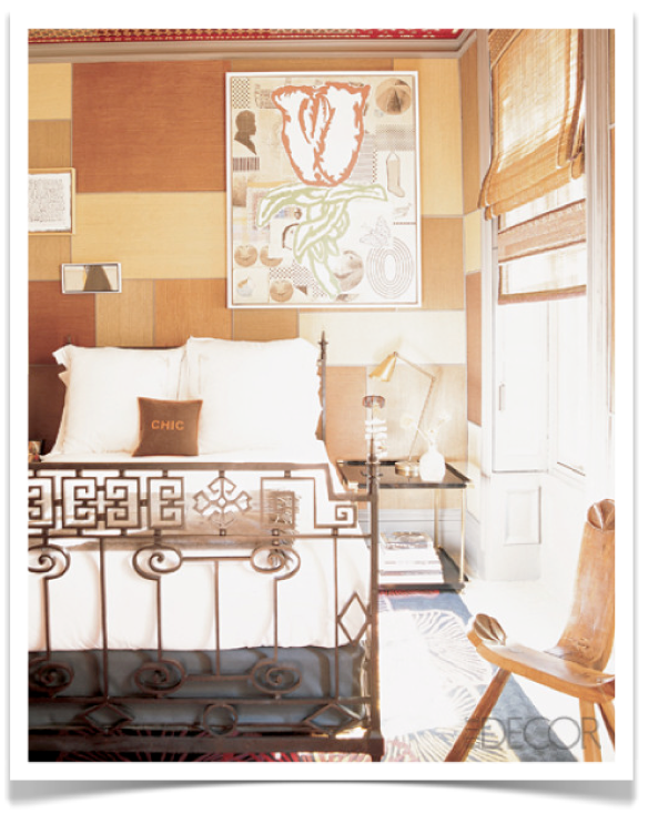
The master bedroom - grasscloth walls ground an ornate Portuguese bed,
it's a restful haven where of soft texture.


The guest suite and it's patchwork medley of grasscloth on the walls...
interesting, but look at the second picture to see the star of the room - 
the ceiling!


Incredible, right? 
I find the painted millwork of all her rooms so inspiring - 
no cloud white here :)


The next thing we got a glimpse of was her Hamptons home,
where wild color frolicked freely....


but the details are more spare, aren't they?
Some of her usual layers seem to have vanished from this design.
It seems that she is playing with color, allowing it to make it's own statement.
That settee seems awfully similar to the pair that had resided in her navy study...
moved here, perhaps?


As Ms. Brandolini's style evolved, her townhome again changed, of course.

In it's latest incarnation, we see much more subdued color,
but the rich detail and texture leave nothing to be desired.

This is by far my favourite version.
It's more refined, less raw, 
and the subtlety allows you to take in the whole space at once, 
without the senses being overwhelmed.


The George Condor painting is back over the sofa...
the coffee table, sofa table and pair of ornate armchairs remain from the previous design,
but a modernist light fixture (Gerrit Reitveld), 
and mid-century sofa and armchairs inject some clean lines into the space. 


The chandelier was moved into the study, where midnight walls became grasscloth.
A drastically different floorplan, one that centers around the window, 
rather than the fireplace, is introduced.

Which do you like better?


This dining room has got me spinning!
The walls are again upholstered, but this time in a white corduroy,
BEADED in Vietnam with her favourite Ernest Hemingway quote.
(we'll see this beading appear again later in the week)

As I am searching for something to place on my own single dining room wall,
I am beyond inspired by this.

The tones of the letters here, all soft and slightly translucent,
and the photos atop...
it's perfect.

And the chairs still remain.
These may be the most versatile dining chairs ever!


Muriel Brandolini is celebrating her twenty years in design with the release of a book on Oct 11.
(pre-order from Amazon and save, I just did!)


It details her design paths, gives insight into what inspires her
(like the beaded bag from Vietanam she found in 1995, that led to her signature embroidered-panel rooms)
and celebrates her former country, Vietnam.


Quite a journey...

I think this quote says it all, don't you?


source 1 2 3 4


Stop by in a couple of days if you'd like to see the extraordinary spaces
 that Ms Brandolini created for other people... x