Friday 30 March 2012

Crushing on Colour: Amanda of {Re}Cycled Consign and Design


Our last Crushing on Colour post comes to us from Amanda of {Re}Cycled Consign and Design. If you haven't checked out Amanda's blog, you are missing out on a fabulous personality that oozes creativity and style! She makes me laugh and swoon - the perfect combination!!


{RE}cycled consign and design


Hello all you Color Crushing darlings.
I am so excited to be divulging my favorite color combo with all of 10 Rooms amazing readers.

For me it's the....
sultry shades of inky blues.

So glamorous.
Splashed with touches of mint and I am smitten.


Fashion or interiors this color pallet has me purrrring with perfection.


With a little dash of pink........


Hope you all enjoyed my color crush.
Don't be a stranger, stop by and say hi here anytime.
I love visitors.


Photobucket


So, so pretty! I love the way you present your images, Amanda - thanks so much for sharing your colour crush with us. My office is the darkest navy, and I love being enveloped by it while I work! Be sure to stop by Amanda's new online store and check out all her gorgeous baubles and treasures.... our vacation is wrapping up, so I'll see you all back here on monday - have a great weekend, lovelies - x Anne-Marie


Wednesday 28 March 2012

Crushing on Colour: Kerry of First Time Fancy


Today the super-sweet Kerry of First Time Fancy is sharing her colour crush with us for the Crushing on Colour series. Kerry is one of the loveliest people I have met through blogging, and she blogs about renovating her heritage home with her husband., her design inspiration, and life with a new (adorable) daughter. Make sure you check out her daughter's nursery when you stop by - it's too cute!


Photobucket


Hello 10 Rooms Readers! Kerry here from First Time Fancy, and I am so glad that Anne-Marie asked me to put together this fun post for her. I've been meaning to do something similar on my own blog, but other posts always seem to get in the way. For months I've been loving pink tones... in particular I've been craving a little more coral in my life. This perfect combination of pink and orange is just so fun and fresh - what's not to love? 


Starting with the boldest, I love a room with a bright splash of coral on the walls...


via a delightful design

pinterest via style me whimsy

via lonny mag


Even just a touch of this cheery colour, can easily liven up a space that would otherwise be simple and dull...


via pinterest

decorpad via pinterest
pinterest via decorpad

via infarrantly creative


What's even better, is that coral is a colour that really compliments any skin tone - making it a fabulous colour for clothes and accessories. Who doesn't love throwing on a bit of coral to brighten up a spring or summer day?


via pinterest

via pinterest

via asos
via asos

stella & dot
Stella & Dot Campari Necklace


It might be how quickly we are jumping into warmer weather, but I am definitely digging coral! Whatever the reason, i'm thinking that I will have to incorporate a little more of this fresh colour into our new home out west, as well as my wardrobe!


Kerry


Thanks so much, Kerry! I am loving all the shades and tints of orange and coral right now. Coral looks so modern paired with all the other clean tints we are seeing right now, and is a classic mixed with neutrals. I'm looking forward to seeing how you incorporate into your new place! (And love that wall of coral grasscloth via Lonny - dee-lish!)  x Anne-Marie


Monday 26 March 2012

Crushing on Colour: Barbara from HodgePodge


Happy Monday, lovelies! I am off on a cruise this week, and so the lovely Barbara from HodgePodge blog is here to reveal her current colour love with a fabulous crushing on colour post for you.... if you haven't read Barbara's blog - you are missing out! She is a diy maven who features regular projects and diy, as well as offering up a weekly interview with some pretty incredible designers... take it away Barbara...


hodge:podge


I am thrilled to be visiting 10 Rooms today!  I love Anne-Marie's focus on colour here at 10 Rooms, I have learned many a tip from her. She does not shy away from colour in her life and home. Love her courage! She has even done a colour consultation for me {one that I have yet to act upon}. I have a tendancy to shy away from large blocks of colour in my home, but anyone who knows me and my blog knows how I LOVE red {along with black and white} But today I will focus on my colour crush: red. Red and I go way, way, way back to grade 1 when I got my first packet of Laurentian pencil crayons. Any Canadian kid, especially ones that grew up in the 70's/80's would have had a packet of Laurentian pencil crayons. Can you guess which colour I ran out of? Yes, red. Not any red, but poppy red. Also a Canadian reference to our Remembrance Day and the poppies we wear to remind us of the sombre day. 


But my love of red carried on into high school when I convinced my parents I needed to have a rainbow themed room with splashes of red. My favourite purchase was a red ghetto blaster. Heavenly.


Now that I am all grown up, I surround myself with red. I don't like large blocks of red, but in small doses. I think small doses make a great impact, like a pow-wow red nailpolish or sexy lipstick. Really adds drama to the space.This is one of my favourite droolicious photos. Gah! A red door and red cabinet with Chiang Mai Dragon covered armchair. 
Died.And.Gone.To.Heaven.


Red artwork and splashes of red in the rug are simply divine.


Red looks especially delicious with black and white.


But nobody does red better than the fabulous Tommy Smythe.


Subtle touches of red, that bring drama and sexiness to a space. 

Red, red, simply divine.


XO Barbara


Thank you so much, Barbara! I really, really love red when it's used as an accent in a primarily neutral space, as you've shown it here. Tommy is the best!! After recently incorporating red into my own home I'm a bit dizzy with the change in energy it's brought to the space. No other colour has the same intensity, in my opinion. Hope you had a wonderful vacation, and I'll be over soon to catch up -  x   Anne-Marie


Friday 23 March 2012

Crushing On Colour: Alena of Oh, It's Just Perfect!


Today's Crushing on Colour post comes to us from the lovely Alena of Oh, It's Just Perfect! I can't think of a better blog title than that, can you? Alena always manages to find the best bits and bobs, and describes herself as an Etsy and Chai tea addict - can you say best friends?!!


Hi 10 Rooms readers! I'm Alena from Oh, It's Just Perfect! and I've been a huge fan of 10 Rooms for a while now, so I'm pretty excited to be guest posting here today about my favorite color. Blue has been my favorite color for as long as I can remember. Not just any blue, but bold, bright blues like sapphire blue, royal blue and cobalt blue. I love the brightness, the intensity and that it actually works with my skin tone (my skin tone is pale, pale, pale). So, while Anne-Marie is living it up on her girl's trip, we can partake in some virtual shopping for some bold and bright blue items.


Cobalt Knob

Samarkand Dinnerware. 

Peek-A-Boo Lace Dress

Louisa Settee


Alena


Thanks so much, Alena! I always love a bit of saturated colour, but especially these rich blues - and you've included my favourite settee from Anthro - oh, to have that in the budget! x Anne-Marie


Wednesday 21 March 2012

Crushing on Colour : Lisa from Lisa Roy


So happy to have Lisa of Lisa Roy {A Designer Obsessed with pretty things, beautiful spaces, interesting places and...handbags!} here today posting about her colour crush for the Crushing on Colour series. Lisa has lived all over the world (she resides in Dubai currently), but her style remains true - fresh, with a light, easygoing vacation vibe that just makes you want to kick back and relax.


a designer obsessed with pretty things, beautiful spaces, interesting places and...handbags!


Hello to all of you lovely 10 Rooms readers!
I'm Lisa from Lisa Roy {a designer obsessed with pretty things, beautiful spaces, interesting places and...handbags!}
I'm thrilled to be invited to take part in Anne-Marie's amazing series Crushing on Colour! 
Today is all about my colour crush:


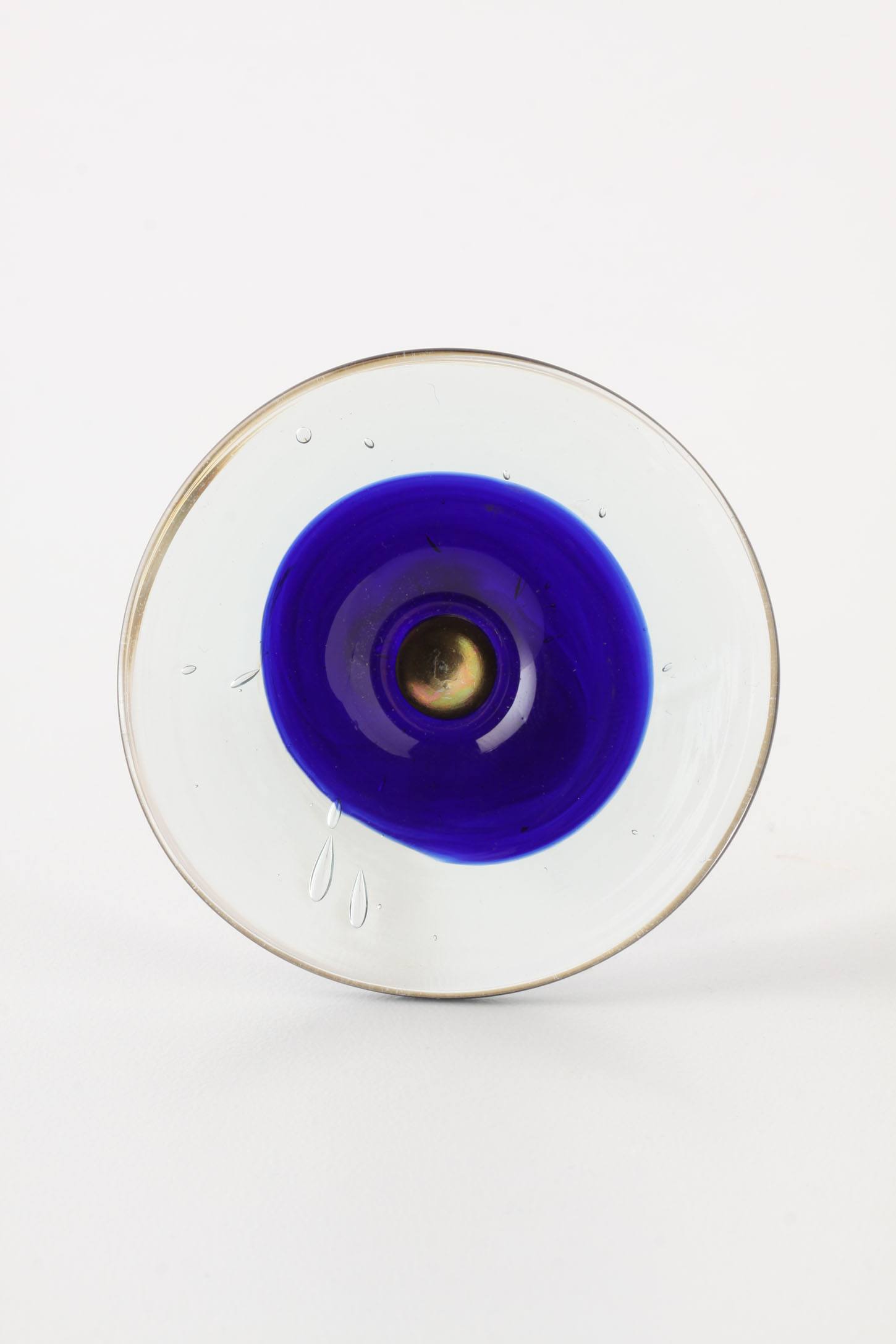
Aqua is one of those colours that just evokes feelings of calm, that gorgeous watery hue that makes you 
just sigh a big relaxing sigh. 
So it's no wonder that aqua has been playing a huge role in bathrooms...


but it is also a perfect way to add a casual seaside feel to a home...


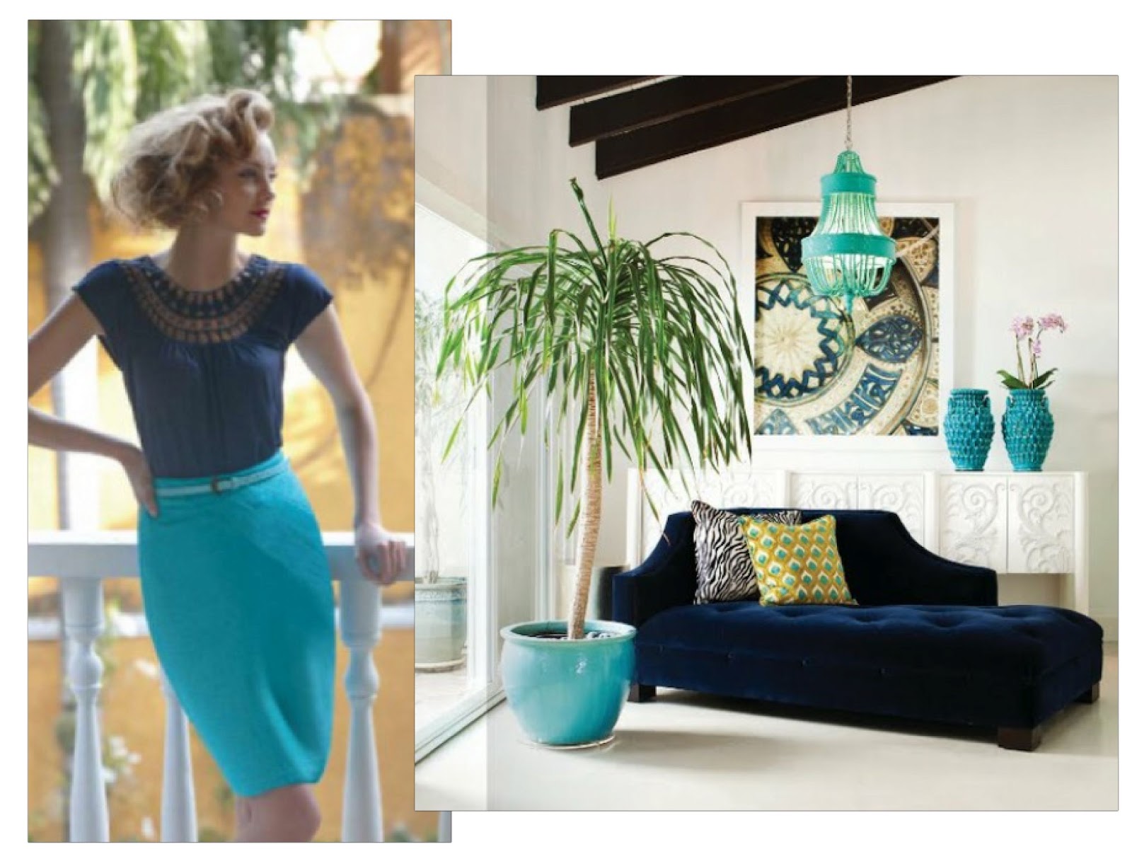
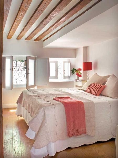
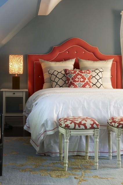
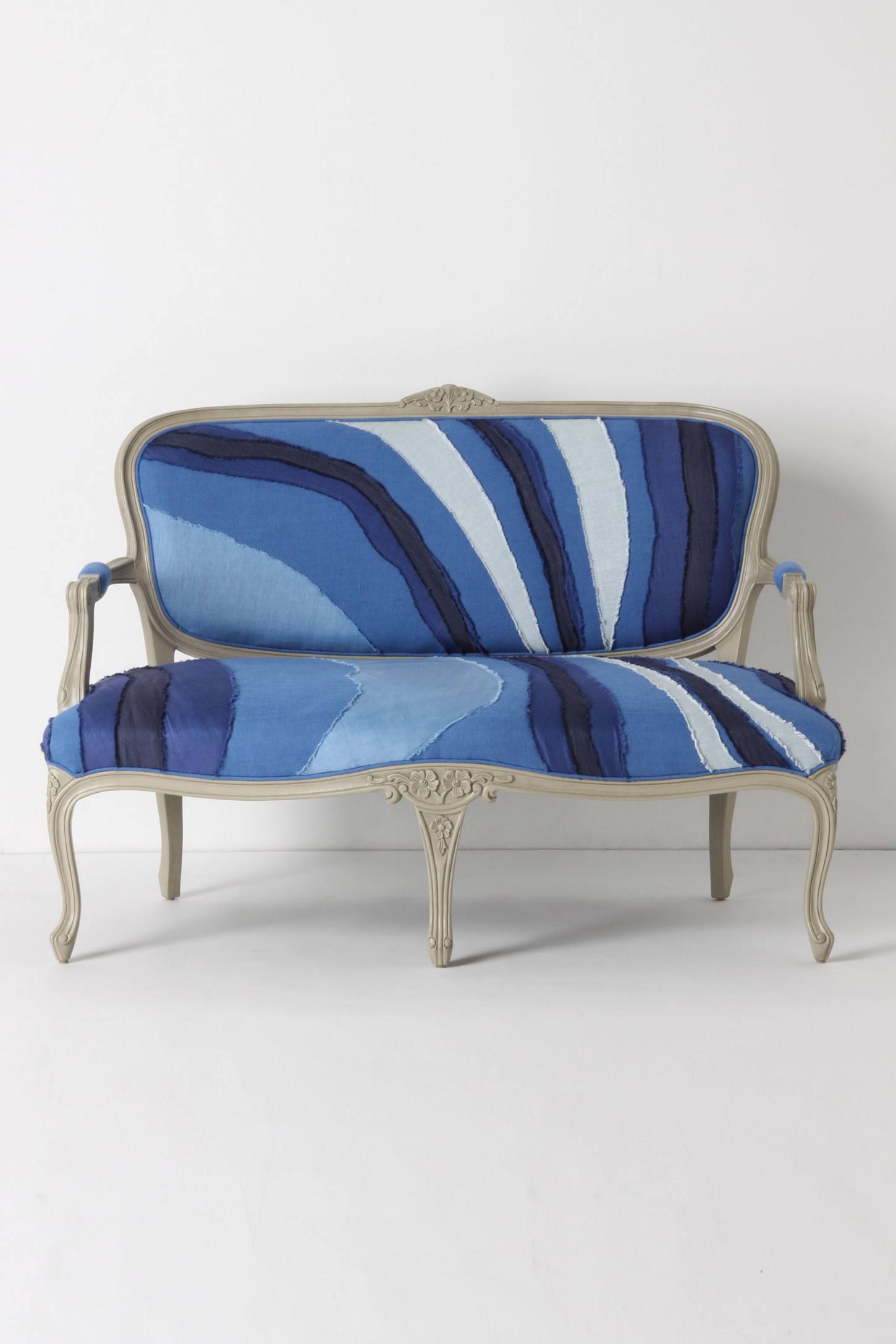
Looking for something as little less casual? Aqua can work in a more sophisticated space as well...


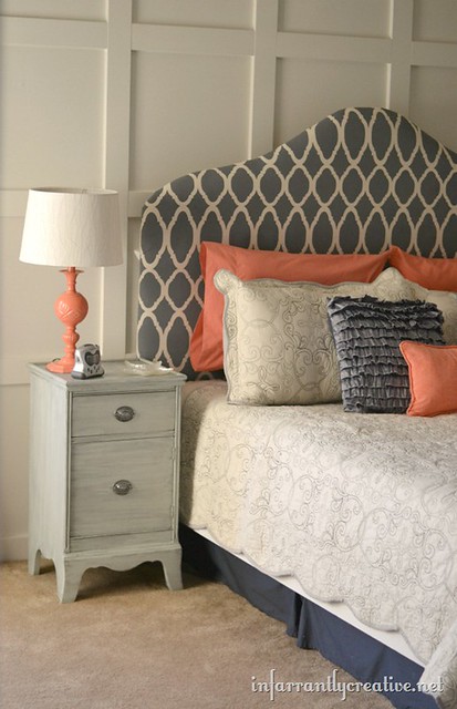
Maybe you don't want to commit to a wall colour but would rather bring in some accessories?


Or you're looking for a fresh new colour for the exterior of your home...


Aqua is a soft, refreshing colour that pairs so well with others like celadon, orange, brown, pink, all the blues and raspberry, to name a few. Whether you choose it in a wall colour, for accessories, or for a piece in your wardrobe, it's sure to make you think you're living by the sea, even if you live in the city.
As for me, I'd love to be scootin' to a seaside cafe on one of these...


So, have you embraced the freshness of aqua?
Thanks Anne-Marie for inviting me to talk about my favourite colour crush!


lisa


Thank you, Lisa, for that take-me-away moment! Such a beautiful, escapist colour - like a tonic for the soul. We have this in our home gym and in Coco's room, and there is no other colour that feels so refreshing. Would be quite happy in any of the spaces you've featured :) x Anne-Marie


Monday 19 March 2012

Crushing on Colour: Holly from HVH Interiors


Let's start off this melange of blogger talent with a Crushing on Colour post from Holly of HVH Interiors. Holly is an Interior Designer and her blog is full of interesting finds and a very warm, modern aesthetic. I especially love the Moodboard Mondays!


HvH Interiors


Hello 10 Rooms readers! I'm Holly, an interior design consultant and blogger over at HvH Interiors. It is such a great pleasure to meet you all here to talk about one of my favourite topics - color. What better place to do that than the "Crushing on Color" guest blog series?! Thank you so much to Anne-Marie for having me.


image link


So let's jump right in, shall we? These days, when it comes to interior design, I have a serious crush on GREY. Grey is often overlooked as a color because it is an achromatic or neutral colour. Yet, it has so much potential. It's my silent hero. Admittedly, grey does have a bit of a bad rap. It is often associated with notions like dullness, bad weather, old age, boredom, and conformity. But this last 'flaw' is what makes grey so great in my eyes. It conforms - blends, adapts, and supports - it can be so many things and it's all up to you to decide.


image link


To understand the versatility of grey, one must realize that there are endless varieties of it, just like with other colours. Grey can be just as cool as it can be warm and therefore it can be easily and appropriately adapted to any interior colour scheme.


image link


My favourite interior scheme at the moment is Grey paired with other neutrals, such as white, black and brown. I find it very calming and grounding. Metallic Greys can add a bit of glamor or industrial flair. Grey paired with wood can often results in this cozy, rustic feeling.


image links: left (1, 2) right (1, 2)
image links: left (1, 2) right (1, 2, 3)


If Grey paired with neutrals is too subdued for your taste, look what happens when Grey gets paired with colour. Whether we're talking big colour or just hints and accents, Grey allows the colours to pop and shine via simultaneous contrast.


image links: left (1, 2, 3) right (1, 2, 3)
image links: left (1, 2) right (1, 2)


Grey is full of potential because you can give it the life you want, depending on what you surround it by. Whether you prefer an interior that is deep and intense or airy and soft, Grey can play a key role. So, dear readers, what are your thoughts on Grey? Best Wishes! Holly


Thanks, Holly! That was an absolutely beautiful post. You found so many inspiring interiors! Grey has become a staple in today's palettes, hasn't it? I love that it provides such a clean backdrop for whatever else you place with it - because I'm always looking for a little smidgeon of colour in there somewhere! x Anne-Marie